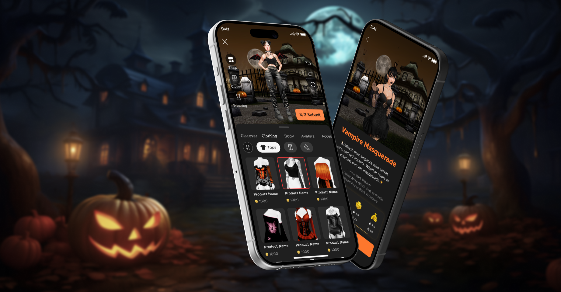
What Players Are Saying
I didn’t expect to get addicted…

Voting is smooth

Rediscover my closet

Principal Product Designer
Sole Designer
0→1 Feature
PM: 2
Eng: 10
Partners: Data, Monetization, QA
Android
iOS
Mar–Dec 2025

As the principal—and only—designer on this 0–1 system, I created IMVU’s first fashion core loop from scratch, introducing Dress-Up, Voting, Scoring & Rewards, and Leaderboards as a connected, repeatable experience. The four prototypes below show the full loop at a glance.
The loop begins with self-expression. Players enter a themed outfit challenge, open the avatar editor, and build a look around a clear brief. Themes and curated item surfaces narrow choice overload, so dressing up feels like a focused creative task instead of an endless catalog browse.
Once looks are in, the community decides what’s good. Players swipe through fast 1v1 matchups, choosing their favorite outfit within the same challenge. Voting gives everyone a job in the system (not just creators) and quietly trains a shared sense of taste for each theme, while also feeding the scoring model behind the scenes.
Votes roll up into a normalized star score plus bonuses. Players see their final score, and collect Credits / Runway Passes tied to that performance. Rewards are designed as fuel—nudging them to re-enter dress-up, try again, or submit multiple looks.
Leaderboards turn individual results into ongoing status. Seasonal and challenge-level boards highlight top trendsetters, showcase their best looks, and let everyone see where they stand—even if they’re not in the top tier. That visibility creates long-term goals: improving rank, finishing a season stronger, and coming back for the next round of challenges.
IMVU is a 20-year-old 3D social platform with ~7M monthly active users and a marketplace of 50M+ UGC items. It offers a rich sandbox for self-expression through shopping, styling, decorating, and chatting, but historically much of that activity has been self-directed and open-ended. For casual users, there was no clear repeatable loop to turn that massive creative economy and those expressive behaviors into ongoing momentum.
The current experience doesn’t consistently answer “what next?”—especially for new and casual users—because there’s limited guidance, progression, and feedback tying actions into a reason to return (or spend).
We’re starting from an unusually strong foundation: expressive 3D avatars, a massive creator marketplace, and social presence. That gives us the ingredients to turn dress-up into a repeatable, rewarding habit.
Competitive research informed four pillars:
A daily reason to play
You want quick wins every day, then bigger weekly moments, and seasonal prestige rewards—so there’s always something current.
A predictable cadence + fresh content.
Attainable status
Status can’t be only for the same top players forever. We use titles, badges, and leaderboards that reset often, so more people can feel progress and get recognized.
Fair, fast judging
Voting is the engine. Keeping it quick, rewarding, and trustworthy—lets every user contribute value, not just creators.
Social structure
Once the solo loop is stable, we will add teams, shared prize boards, and borrowing/helping to reduce friction and make the loop stickier.
Our strategy was to turn self-expression into a repeatable Live Ops loop by adding clear goals, lightweight participation, visible progression, and value-first rewards. Rather than pushing monetization directly, we focused on creating a system users would want to return to regularly — where spending felt purposeful because it supported play, recognition, and progress.
Dress-Up is where each day’s story starts. Players wake up to a fresh themed challenge, imagine who their avatar wants to be that day, and build a look that fits the brief. Once they’re happy with the outfit and hit submit, that look heads into the rest of the core loop: being seen, voted on, scored, and ultimately celebrated on leaderboards and through rewards.
Key Design Decisions I Made:
• Unified shop + closet with live preview
I combined Shop (challenge-specific items) and Closet (owned inventory) into a single workspace, with a persistent avatar preview at the top and a “Wearing” view that shows every equipped item , so players can quickly switch between shopping, closet, and current outfit and get dressed for the challenge fast.
• Submission status
The submit button doubles as a lightweight status indicator, showing simple progress like “1/3” or “3/3” instead of a heavy requirements panel, so players always know how close they are to submitting without leaving Dress-Up.
• Themed visuals to guide styling
Each challenge uses its own primary/secondary colors and a matching room background so the UI reinforces the theme, helps players dress to the brief, and keeps the experience from feeling less static over time.


Voting lets the community decide which looks rise to the top. Players see two outfits from the same challenge in a head-to-head view, tap their favorite, earn Runway Passes for milestones, and can jump straight into shopping the items they liked—all while feeding the scoring system behind results and leaderboards.
Key Design Decisions I Made:
• Head-to-head over rating systems
Instead of stars, sliders, or thumbs up/down, I chose a simple 1v1 “pick your favorite” tap. It’s faster on mobile, less tiring, and gives cleaner, fairer results within each challenge theme.
• Delightful, instant feedback
To make the moment feel satisfying, voting is one-tap with a quick haptic vibration as confirmation. After a pick, the winning look scales up, while the losing look shrinks and fades into a darker background—so the outcome is instantly clear without extra UI.
• Shop the look
You can tap the Shop button under the avatar to see every item that makes up the outfit, add them to your cart, and purchase instantly. Revenue is shared between the item creator and the outfit submitter who assembled the look, fueling long-term creator earnings and an affiliate-style economy.


Scoring & Rewards is where the challenge story pays off. Once voting wraps, players return to the Challenge Hub to see how their looks performed, understand their star rating and bonuses, and claim rewards that fuel their next round of creativity.
Key Design Decisions I Made:
• One hub for styling, voting, and results
I kept Styling, Voting, and Results inside a single Challenge Hub so players don’t feel like they’re bouncing between separate features. They can move fluidly from building a look to voting to checking scores and rewards with one mental model and consistent navigation.
• Clear states with My Results and Pending Results
I split the results surface into “Pending Results” (submissions still in voting) and “My Results” (completed scores and rewards). This makes it easy for players to instantly see which looks are still in progress and which ones are ready to celebrate and claim, instead of digging through a mixed list.
• Breadcrumbs for new results
I added a breadcrumb-style path with subtle indicators along the hub entry and results tabs so that when new results come in, players see there’s something waiting and know exactly where to tap next.


Global Seasonal Leaderboards turn a run of outfit challenges into a bigger, time-boxed competition. Players can track how their scores stack up across multiple challenges, and chase aspirational rewards over days or weeks instead of a single event. That long arc gives them a reason to keep coming back, experimenting with more looks, and following top trendsetters. For us, it becomes a retention engine and a social spotlight.
Key Design Decisions I Made:
• Animated entry for unclaimed rewards
I used an animated leaderboard entry point that lights up whenever there’s a new seasonal reward to claim, plus a subtle shaking gift box inside the leaderboard. The goal is to pull players back into the feature at just the right moment and clearly guide them to “unbox” any gifts they’ve earned.
• Sticky placement for your rank
Your own row on the leaderboard becomes sticky once it would scroll off-screen, so you can always see your exact position while browsing. This keeps progress and goals visible, even if you’re nowhere near the very top.
• Leaderboards as a social discovery surface
Tapping any user lets you see their top submissions for the season, learn from their styling choices, and jump to their profile to follow or friend them. That turns the leaderboard from a static ranking list into a social discovery layer where players can find new style inspirations and new people to connect with.


Runway Passes are the “energy” behind the entire outfit challenge loop. Every submission costs passes, which slowly recharge over time, while extra passes can be earned by voting, watching ads, or bought in the Dollar Store. For us, that turns challenges into a repeatable, tunable loop that drives retention, session return, and monetization without hard-stopping free players.
Key Design Decisions I Made:
• Always-visible, predictable balance
I made sure the current pass balance and recharge state are visible from the challenge hub and submission flows, so players always know: “Do I have enough to submit? When will I refill?” This reduces confusion, builds trust in the system, and nudges players to come back when their passes top up.
•Smooth “I don’t have enough” recovery paths
When players run out of passes, they get a focused dialog with clear options: watch ads, buy passes, or go earn more via voting—without being kicked out of dress-up. That keeps them in flow instead of turning a blocked submission into a rage-quit moment.
• Two distinct visual systems for buying vs earning
I designed two complementary graphics sets: flat, bucket-based icons for Dollar Store packages (55, 150, 350, 800 passes, etc.) that read clearly as “value tiers,” and a more realistic, celebratory style for rewards screens where counts are small (1–5 passes) and feel precious.


Closed Beta Program (Private Discord + 3-week releases)
I partnered tightly with engineering and iterated fast. Once the first version of the Dress-Up Room was live (around month 3), we launched a closed beta with ~200 beta users in a private Discord. Every three weeks, we shipped new iOS/Android builds with features and fixes, then collected feedback directly from players. Sentiment was overwhelmingly positive—and we received sharp, actionable notes that shaped each subsequent release. Below are a few screenshots from the beta channel.
Internal playtests (weekly)
In parallel, we ran 90-minute internal playtests every Friday to catch UX friction and bugs early.

Key feedback—external and internal—was translated into Jira tickets, prioritized with the team, fixed, and then re-verified in the next build. It was rewarding to see real users shape the product—and to iterate quickly with engineering week over week.
Hover to flip and see the "before" images.


Dress-Up – Add Shop & Closet "Search"
Voting – Add "Tie" and "Skip" Options
Closet – Add "Saved Looks" Entry Point
Categories – Add Tier 2 “All” Option


Wearing Session – Add “Clear All” Action
Checkout – Add Timer & Preview Look
Preview – Add "Save Look on Submission” Option
Submission Rewards – Add CTA "Watch An Ad for Promo Credits"
We rolled this out in stages to de-risk scale—stress-testing performance, economy, and moderation as we ramped from hundreds to tens of thousands of players. VIP tiers gave us a natural ramp: Emerald → Diamond → Platinum/Legacy → Gold → eventually all users. Early access also supported upsell: we surfaced it to non-VIPs with clear “VIP gets it sooner” messaging.
This staged rollout enabled multiple rounds of UX iteration along the way—so by the time we hit the all-users launch, the experience was noticeably tighter, clearer, and more intuitive.
In the first 14 days of Outfit Challenge v1.0, the loop is already behaving like a self-sustaining system. Data from Dec 7–20 shows a strong, encouraging start—strong spend and healthy repeat play, even before FTUX, broad discoverability, or deeper social integration were in place.
At the same time, we still see friction in early gamplay experience and low number of new user submission, so the next phase is about smoothing that first experience and scaling discoverability.
And we believe outfit challenges will be a thriving feature providing a new sustainable revenue stream, attracting new users to the platform, and helping users connect in meaningful ways.
Over 41,000 unique players have submitted at least one look.
Each challenge sees 3–4K unique voters generating ~40–50K votes.
In 10 days, 1k+ credits spent per player per challenge.
After a second submission, over 70% of users submit again.
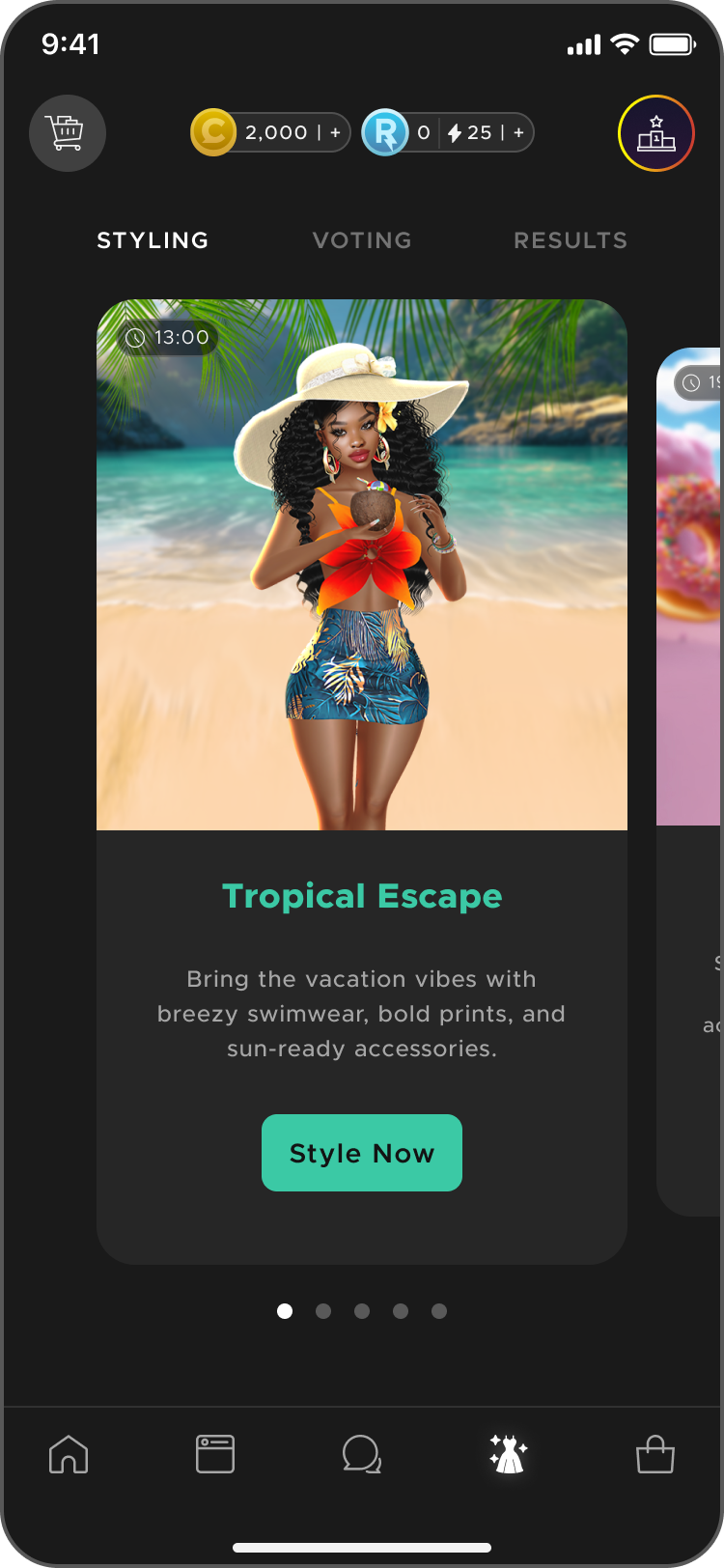
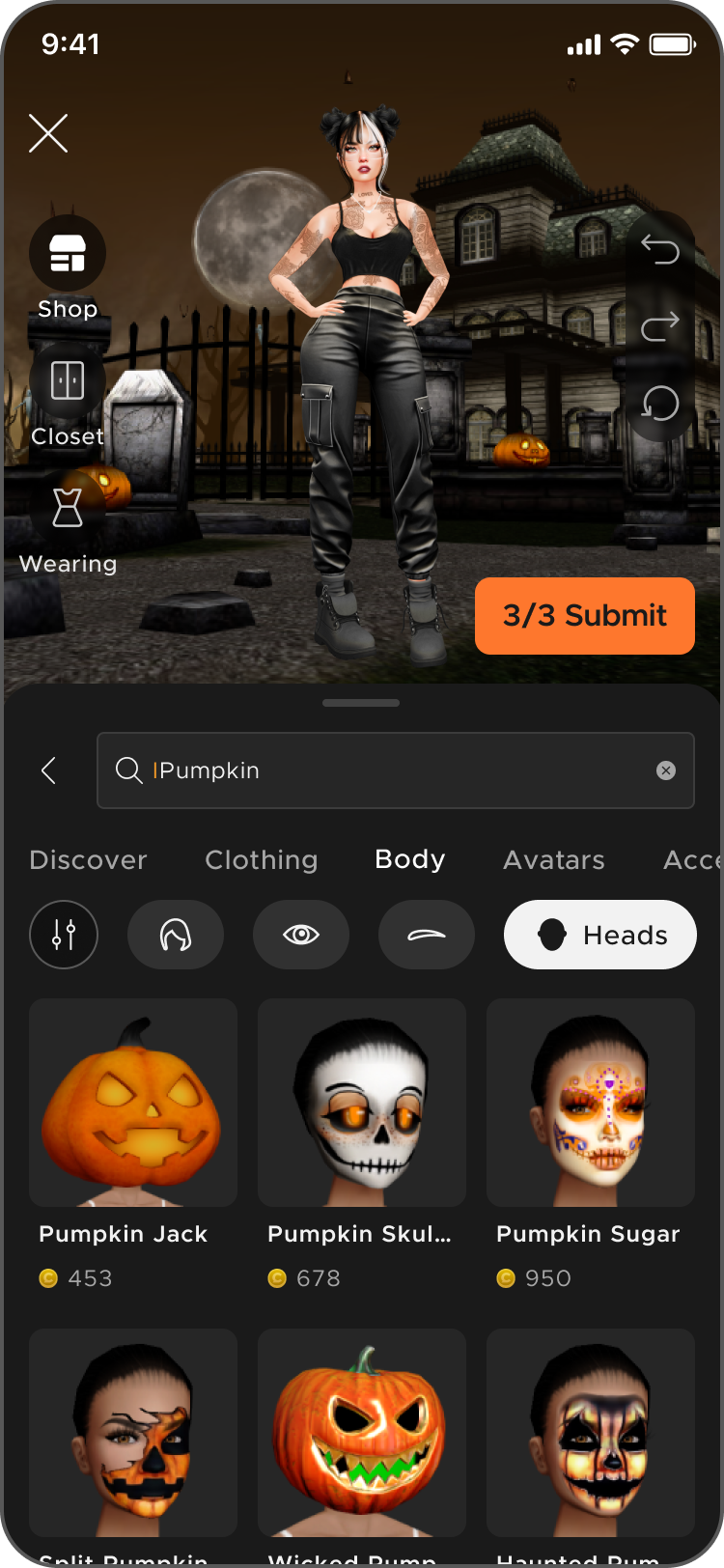
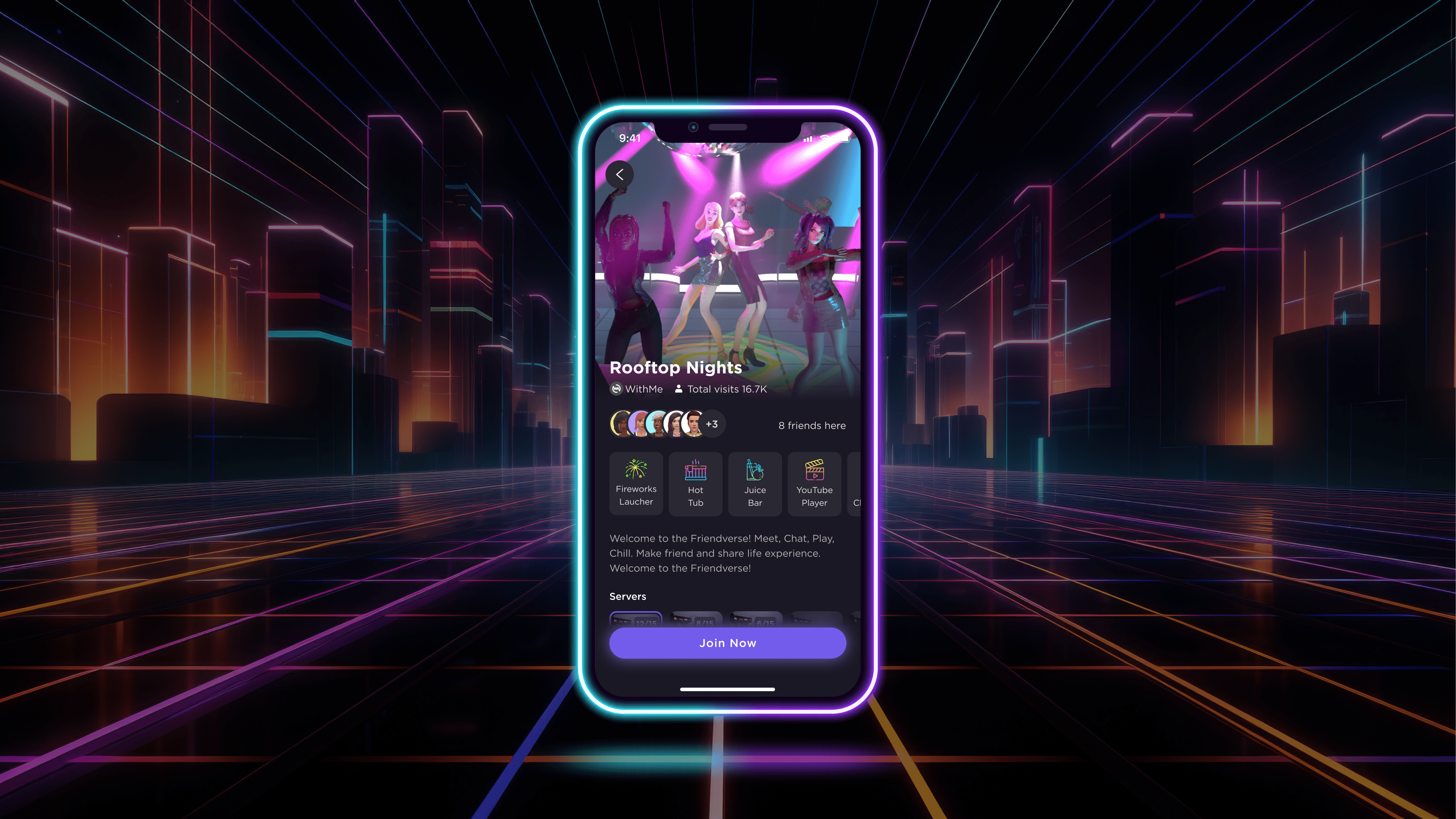
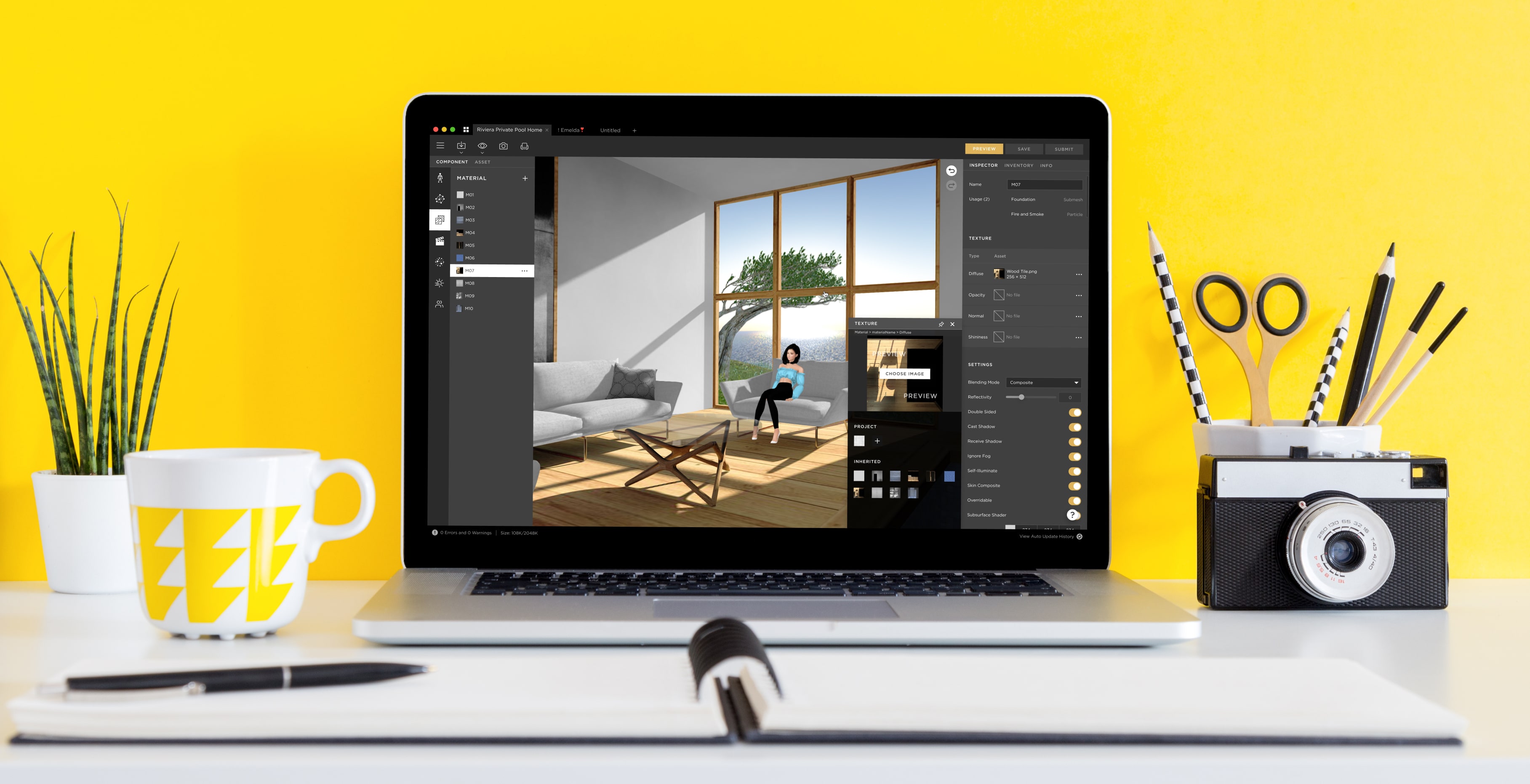
I’m high-agency in ambiguous spaces, so for this project I didn’t wait for a perfect PRD. I built a Figma prototype upfront to make the core user experience tangible, brought it to our first onsite session, and facilitated alignment across PM and engineering. Then I translated the design into engineering prototyping/exploration tickets so we avoided weeks of pre-coding churn. With a shared vision, engineers could start exploring and coding in sprint one, while we iterated quickly through internal playtests.
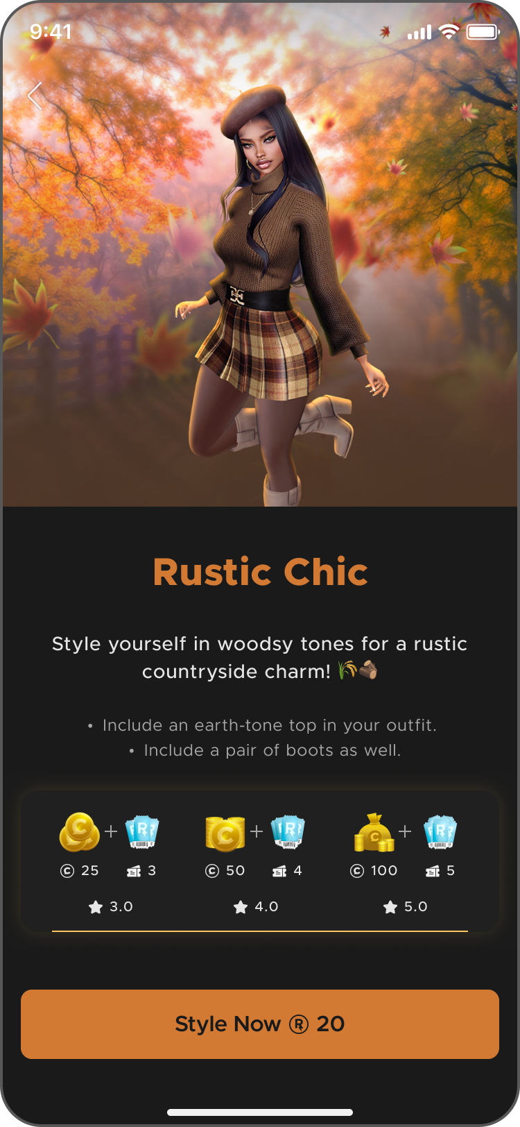
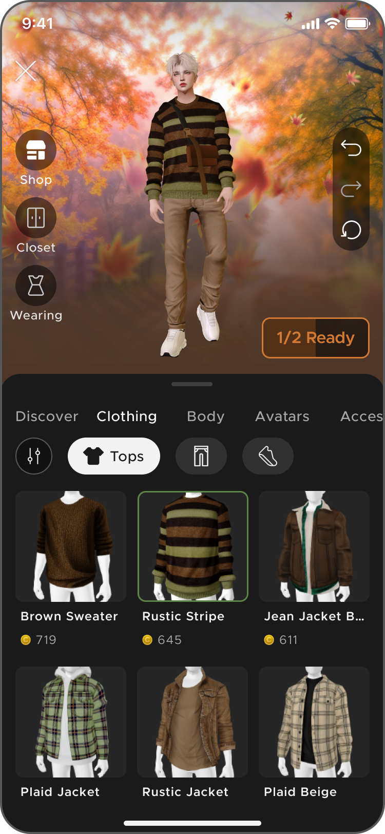
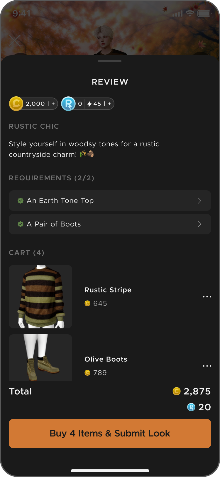
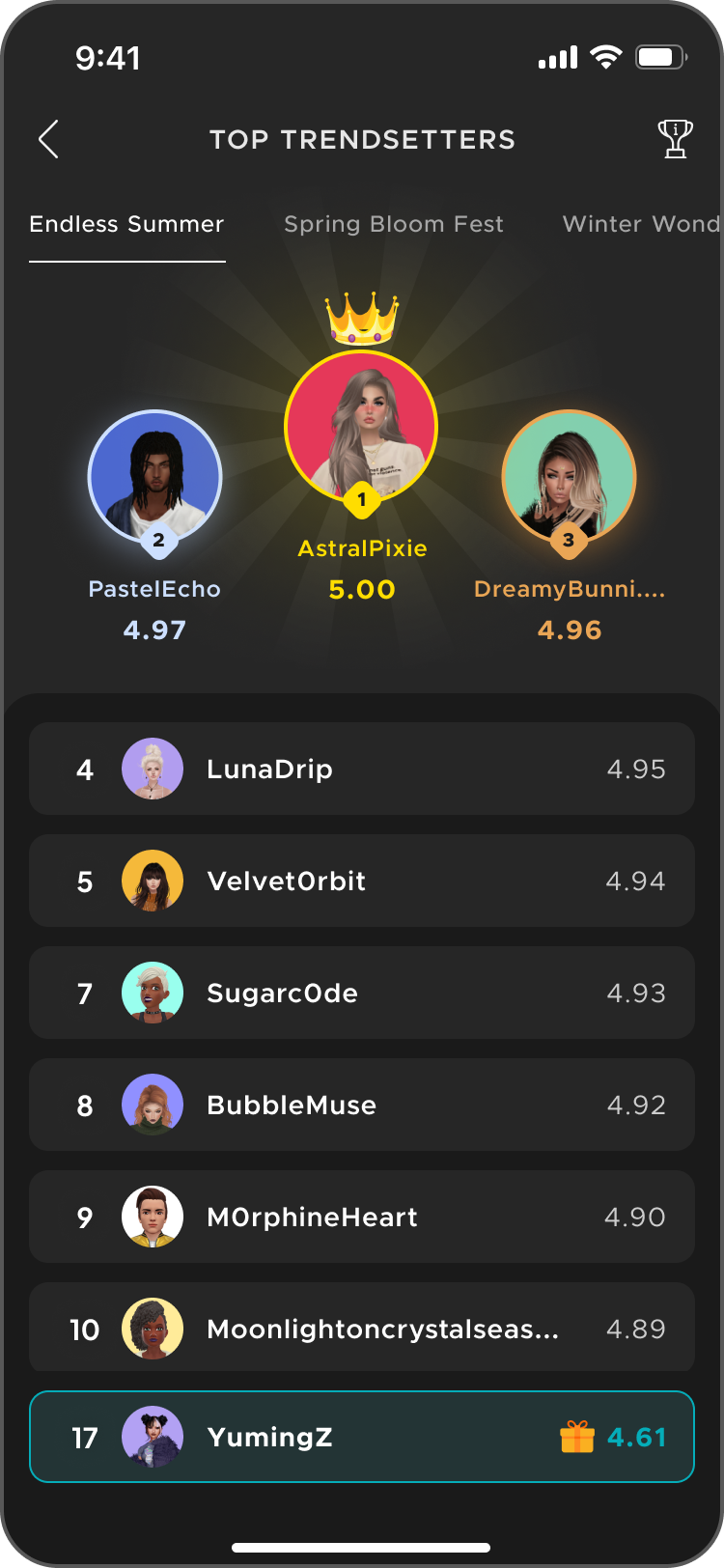
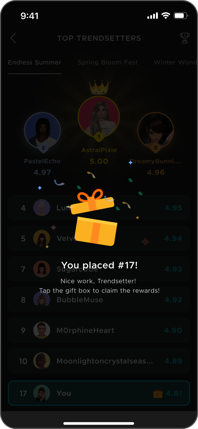
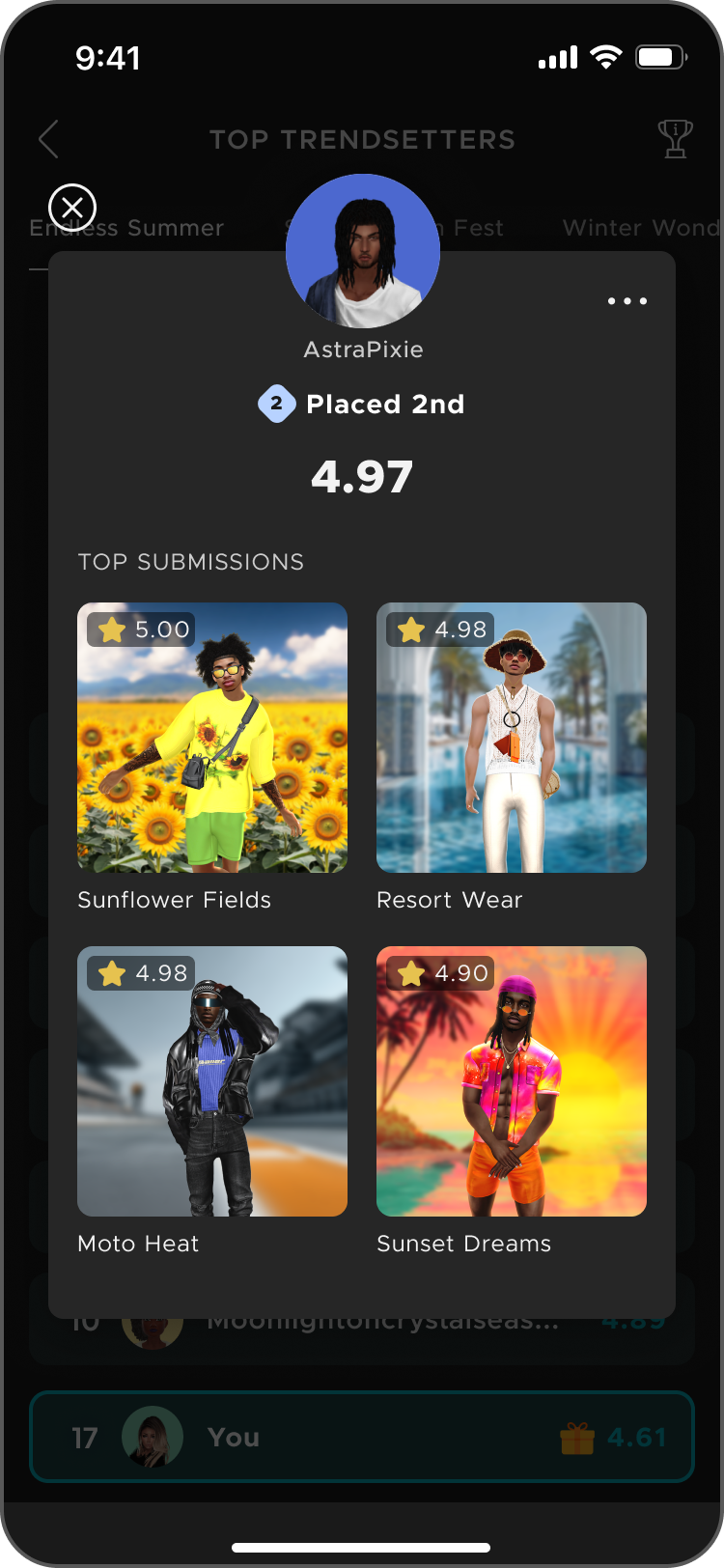
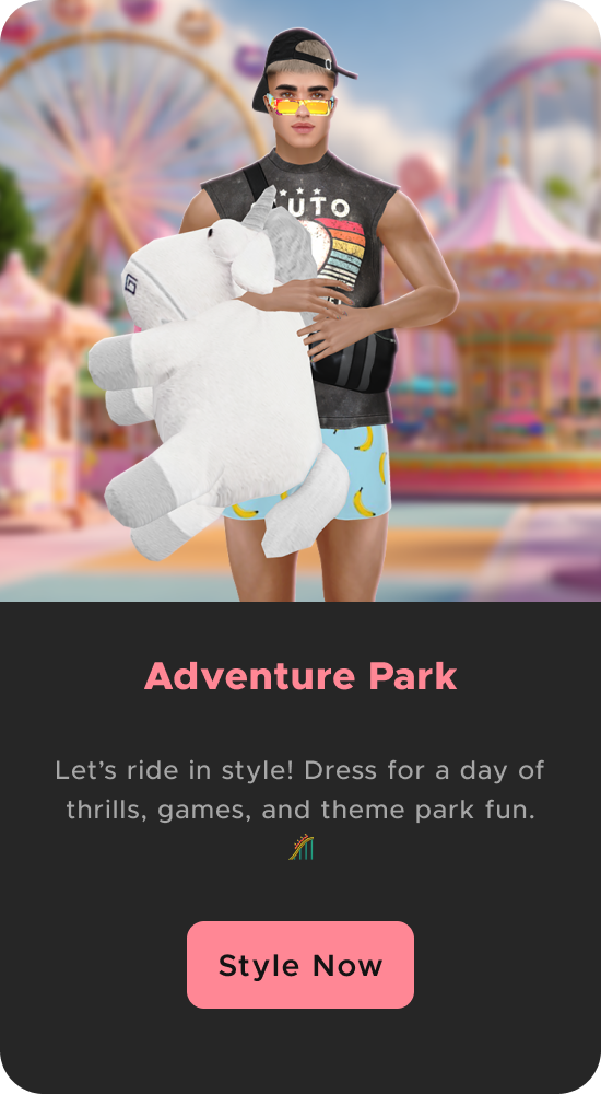
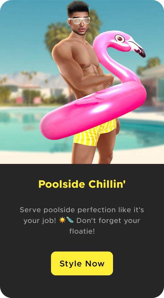
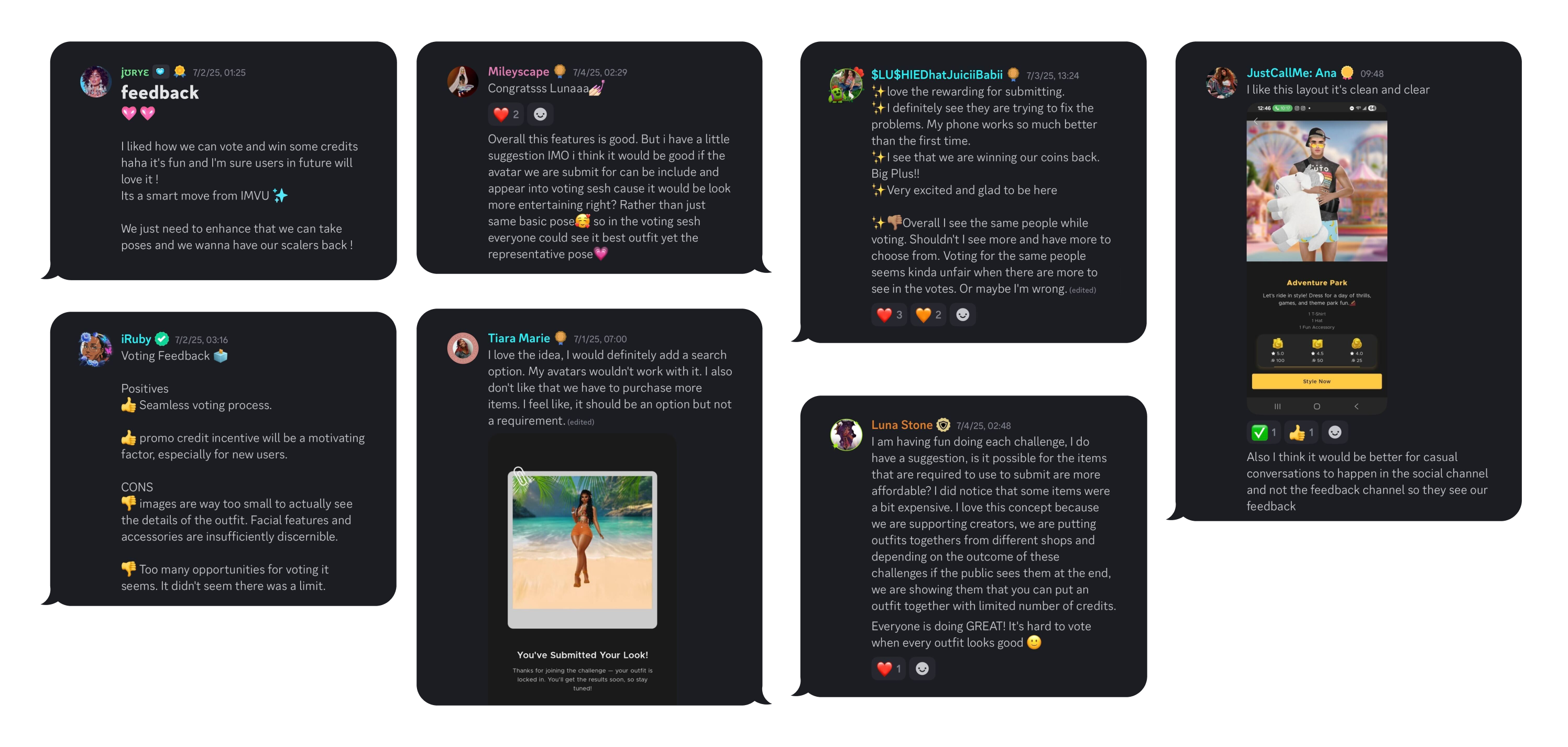
Being part of the beta Discord group made the work even more meaningful. We saw user excitement, suggestions, and outfit screenshots — which directly informed our next iteration. Internal playtests added another layer of feedback and improvement.
This high-tempo testing approach — running many small, fast experiments in short cycles to learn and iterate quickly, instead of betting on one big, slow release—helped us steadily sharpen the experience with each build.
As we approach the full rollout, we’ve built a strong foundation for a gamified experience that engages both users and creators. The iterative beta process has surfaced valuable insights into user behavior, monetization opportunities, and system scalability.


